Teachers Mutual Bank Limited
Banking product redesign — consolidating chaos into clarity
My role & responsibility
I collaborated with
Duration
June – August 2025
Project in one line
Decluttered the banking suite and introduced standardised templates and product cards to streamline the browsing experience, while refreshing the colour palette and typography to improve accessibility and support the 2026 brand evolution.


What I did?
Defined a scalable page structure and built reusable templates, standardising how banking products are presented across the platform.
Re-architected the information hierarchy and navigation, so users could move through the experience with less cognitive load.
Integrated new savings products into the suite, improving clarity around product benefits and who they're for.
Shook up the design system by introducing a new set of colour and typography tokens, making it easy to visualise the original and proposed brand identity side by side.
See before & after below 👇
Post-project thoughts
Looking back — what a fun and impactful project! In mid-2025, I decluttered the banking suite and restructured the browsing experience for banking products, which to some degree informed how we'd go on to expand the new website design in 2026. More importantly, I learnt to make only the minimal and necessary changes, so the team could put their time and energy into other projects.
Metrics
Banking (formerly “Account") page view: ~48% uplift on banking page views post-launch (September 2025 – March 2026)
2 new savings products (Momentum Saver and Starter Saver) attracted 120,000+ combined page views in their first six months using the new template. (September 2025 – March 2026)
The challenge
The trickiest bit was sticking to the existing components — some of which weren't built optimally — while still delivering a journey with less friction.
What impact has the project had?
Intangible impact
Starting this project felt a bit bittersweet. There was no existing design foundation, no precedent, and the work surfaced a mix of expected and unexpected issues along the way. But those learnings became valuable inputs for Phase 2 improvements.
Seeing the experience actively used, and later iterated on, by the Internet Banking team reinforced that the work created real operational value and laid the groundwork for a smoother form-filling experience.
Tangible impact
By November 2025, more than 20% of customers successfully completed the KYC process online. This helped speed up customer data collection, reduced manual processing for the bank, and introduced a digital capability that previously didn’t exist. The new experience supported 21,000+ online submissions.
What I focused on - and why
Listed all existing product index pages and product pages.
Why? Sounds obvious, but it gave me a holistic view of the project scope and helped me align with the product team on which products were in play.
Mapped out how users get from any page to a product page, and how they sign up.
Why? To uncover the current journey(s) and evaluate how and where users could actually retrieve banking product information.
Audited the product detail page layouts and identified shared patterns across products.
This led me to propose a unified page template — which also laid the groundwork for the 2026 website transformation.
Competitor research.
Looked at how others structure their banking suites, then sense-checked what was actually relevant and doable for us.
What changed - Before & after
*The following images are recreated versions of the original product and do not reflect the exact live interface. They are intended to closely represent the experience while demonstrating my design process.
before #1
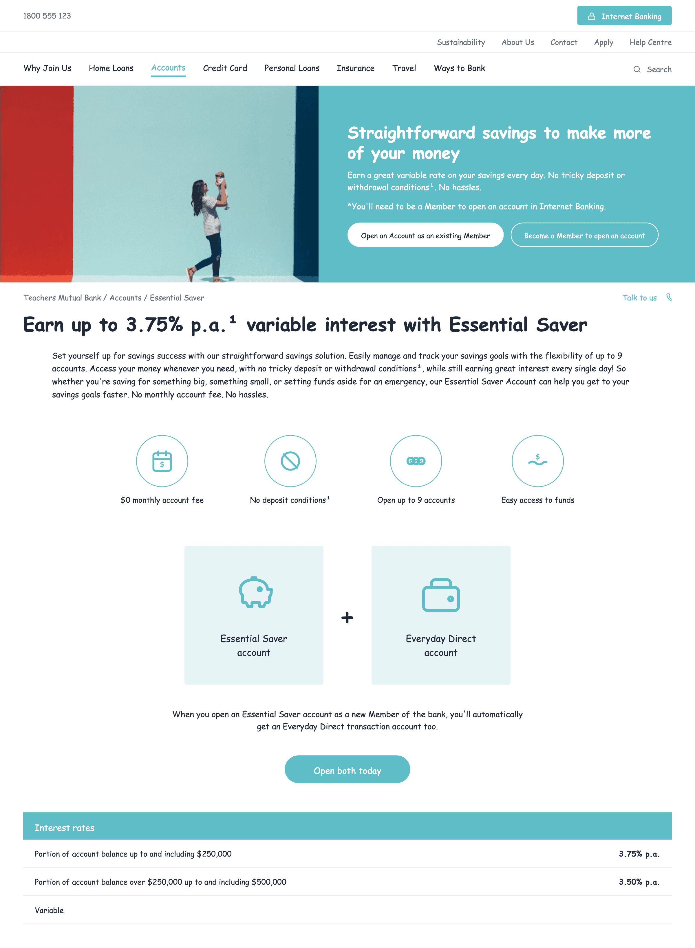
4 category pages and 6 products. Some category pages and product index pages had overlapping content.
Term deposit had its own category page — but there was only one term deposit product at the time. Once you landed on the product page, you had to click another button to read the rates on yet another page. Rates are arguably one of the first things a user needs to make a decision, so that extra click was working against them.
Same story for the transaction account — one product, its own category page, and two detail pages where the more interesting features were hidden behind a click on the first detail page.
Opportunities
Redefine the banking category, consolidate repetitive content, and prioritise the content that actually matters — rates, fees, eligibility.
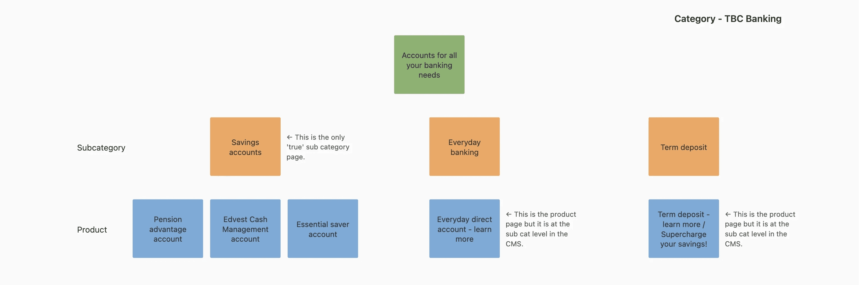
Banking products information architecture
after #1
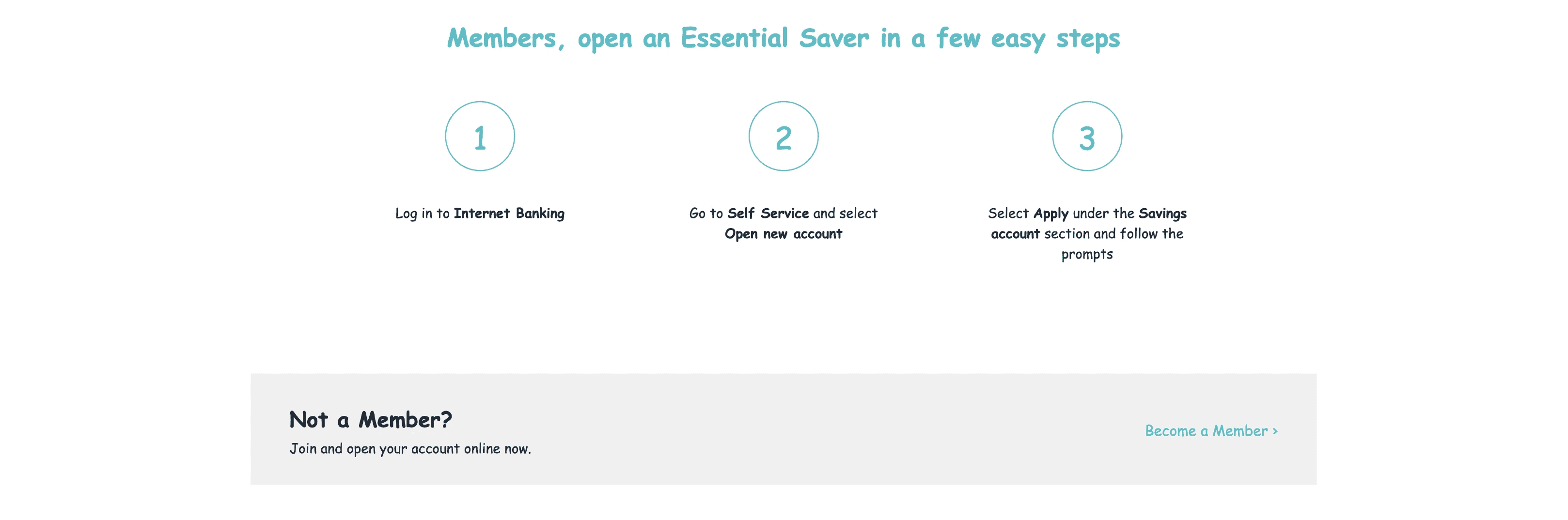
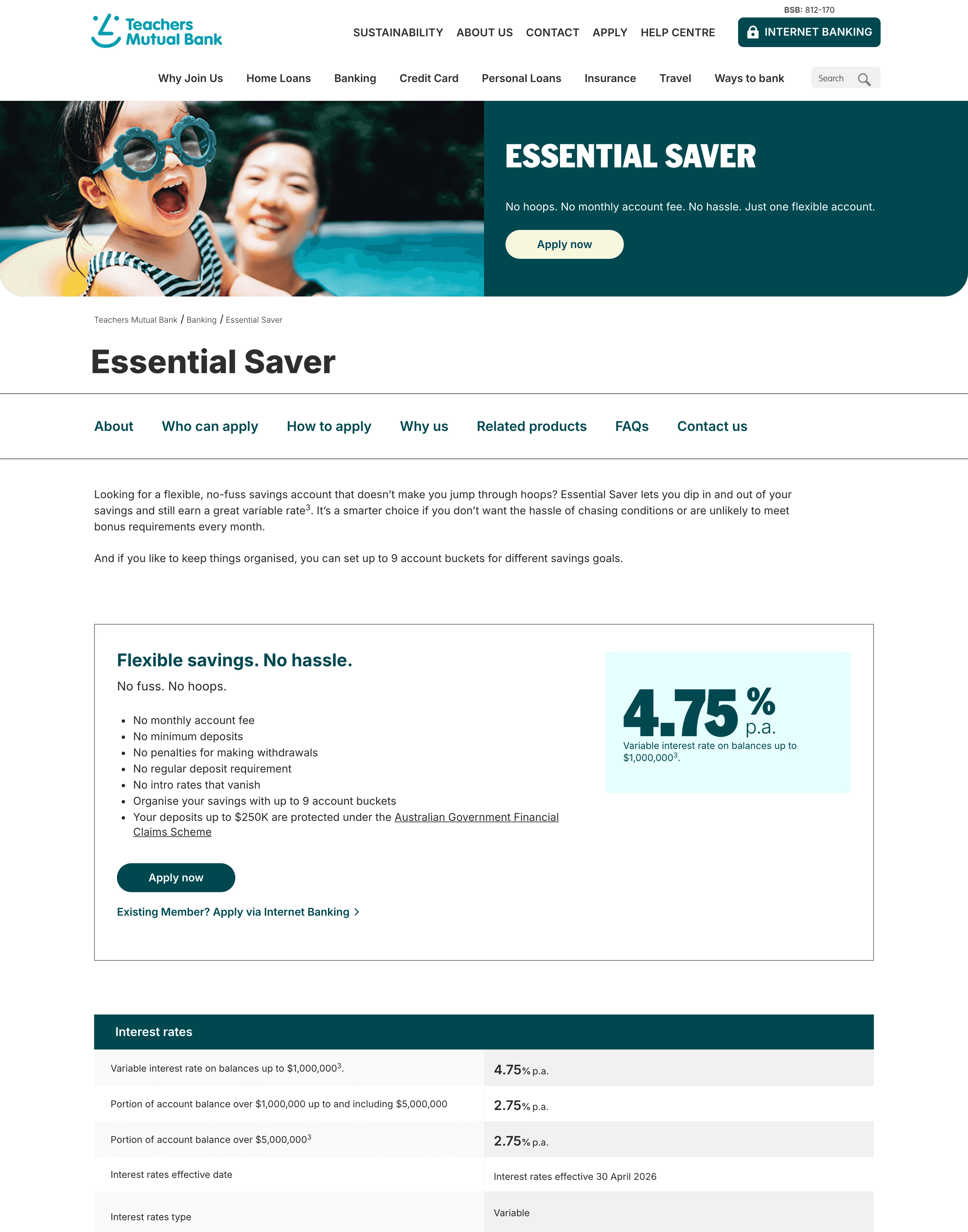
Both term deposit and transaction account were reshaped into the category page → product detail flow.
In fact, all products now follow the same structure. Since the product details had been scattered across multiple pages, I created a standardised template that brings everything together on one page.

Transaction account page showing anchor links positioned below the page title to indicate page structure (May 2026)
before #2
Users couldn't easily find products that were relevant to them, even though some product names hinted at their target audience.
Example: Essential Saver, Edvest Cash Management Account.

*Banking (formerly account) page
after #2
I re-organised the page so it surfaces the types of products and who they're for.
Just by skimming the card titles, users can quickly tell whether it's worth reading on.

Banking page (March 2026)
before #3
Unclear eligibility criteria to apply for products
Teachers Mutual Bank has specific requirements around who's eligible to become a member and apply for certain products. These weren't laid out clearly for newcomers, which created friction — people would either wonder, or stop the application altogether.

*Instructions for applying for a term deposit
*Instructions for applying for a saving product
after #3
I standardised a module that explains membership and helps users figure out whether they're eligible. I also brought more clarity to the products that minors can apply for, with or without a parent/caregiver.

Instructions for applying for a savings product available to both adults and minors (March 2026)

Instructions for applying for a transaction account (March 2026)
before #4
The colours and typography weren't very accessible.
The team was already aware and working on a new palette and new fonts that's more modern and WCAG-compliant.
*Original colour palette shown on savings account page
after #4
As the sole UX designer at the time, I applied the new colours and typography across the website bit by bit to make sure we met WCAG standards, while consulting the brand and marketing team to keep the broader brand identity consistent across other channels like print.
Refreshed savings account page (May 2026)
Side note
To preserve more of our original brand identity, I expanded the design system by adding the new brand colours as a separate token collection in Figma. During the transition period, I often needed to show the old and new brand colours side by side on other project initiatives — and that turned out to be really useful, since stakeholders had much better visibility on how the design would evolve once changes were implemented.
What I would do differently
If I'd had more time, I'd have run a quick usability test on the template before rollout—the metrics say it worked, but I'd love to have validated the why sooner.