Teachers Mutual Bank Limited
Redesigning the corporate site as part of the digital transformation project
Role
Duration
Launched
5 May 2026
The challenge
Teachers Mutual Bank Limited's corporate site was fragmented. Critical information—annual reports, meeting notes, governance details, news—was scattered across unclear categories. Stakeholders (shareholders, regulators, members) couldn't find what they needed without friction. And the old design didn't reflect TMBL's new brand identity or accessibility standards.
The rebuild needed to do three things at once: modernise the platform, bring order to the information architecture, and embed the new design system—all on a tight timeline.
Why it mattered
For a financial institution, the corporate site isn't just marketing. It's a trust mechanism. Shareholders, regulators, and members rely on it to find annual reports, meeting materials, and company news.
The old structure created risk: important information was buried, accessibility was poor, and the design felt dated.
The rebuild solved three business needs:
Risk & compliance — Clearer IA and better accessibility meant stakeholders could find critical information faster, reducing support friction and compliance risk.
Brand coherence — The new design reflected TMBL's 2026 brand identity, creating consistency across print and digital.
Platform modernisation — Moving to a new tech stack meant we could design for scalability and maintainability from day one.
What I did
I redesigned key sections across the site—from governance and leadership pages to news, reports, and member communications—each with distinct IA and design challenges.
Interface design
Aacross eight core sections (leadership, governance, news centre, reports, member meetings, financial disclosures, privacy, contact)
User flows
For key journeys (finding annual reports, locating meeting materials, understanding board structure)
Information architecture refinement
Flagged low-priority pages early in the sprint, helping the team streamline scope and the content team focus their effort
Design system integration
Built components and tokens in the new TMBL design system, ensuring consistency across the rebuild
What changed: Before & after
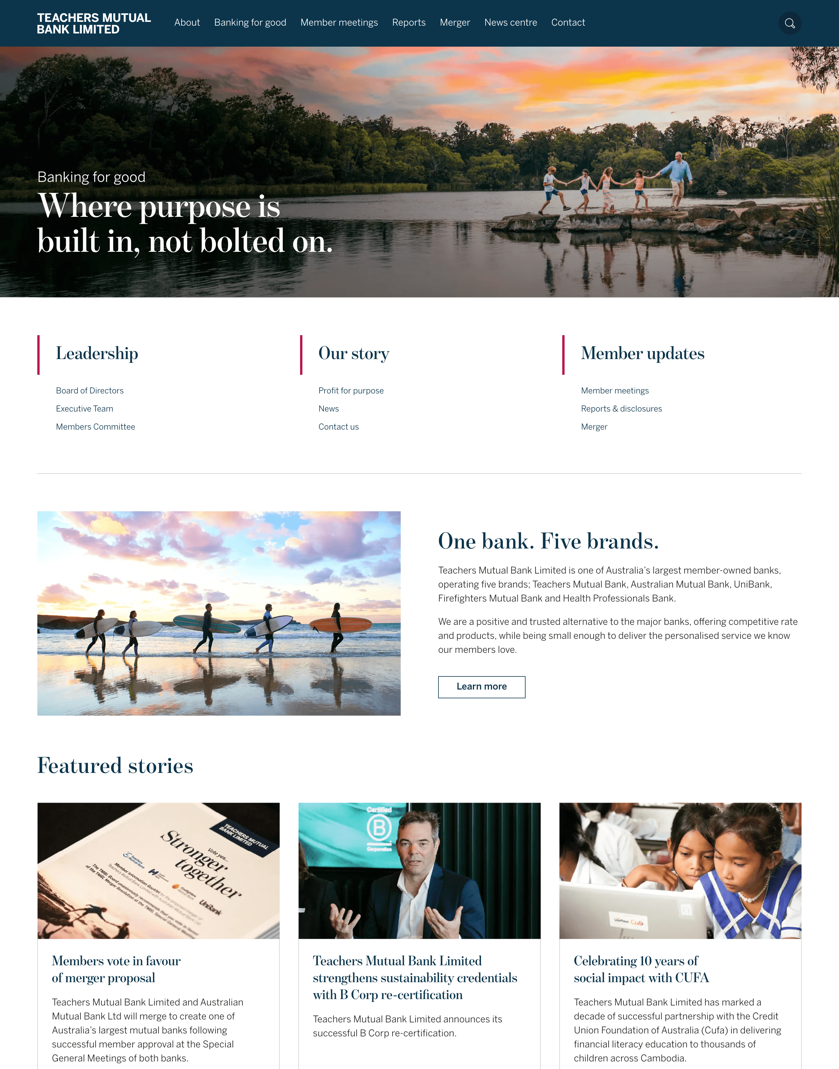
Since this was a full site revamp, I've highlighted four sections that show the transformation most clearly.
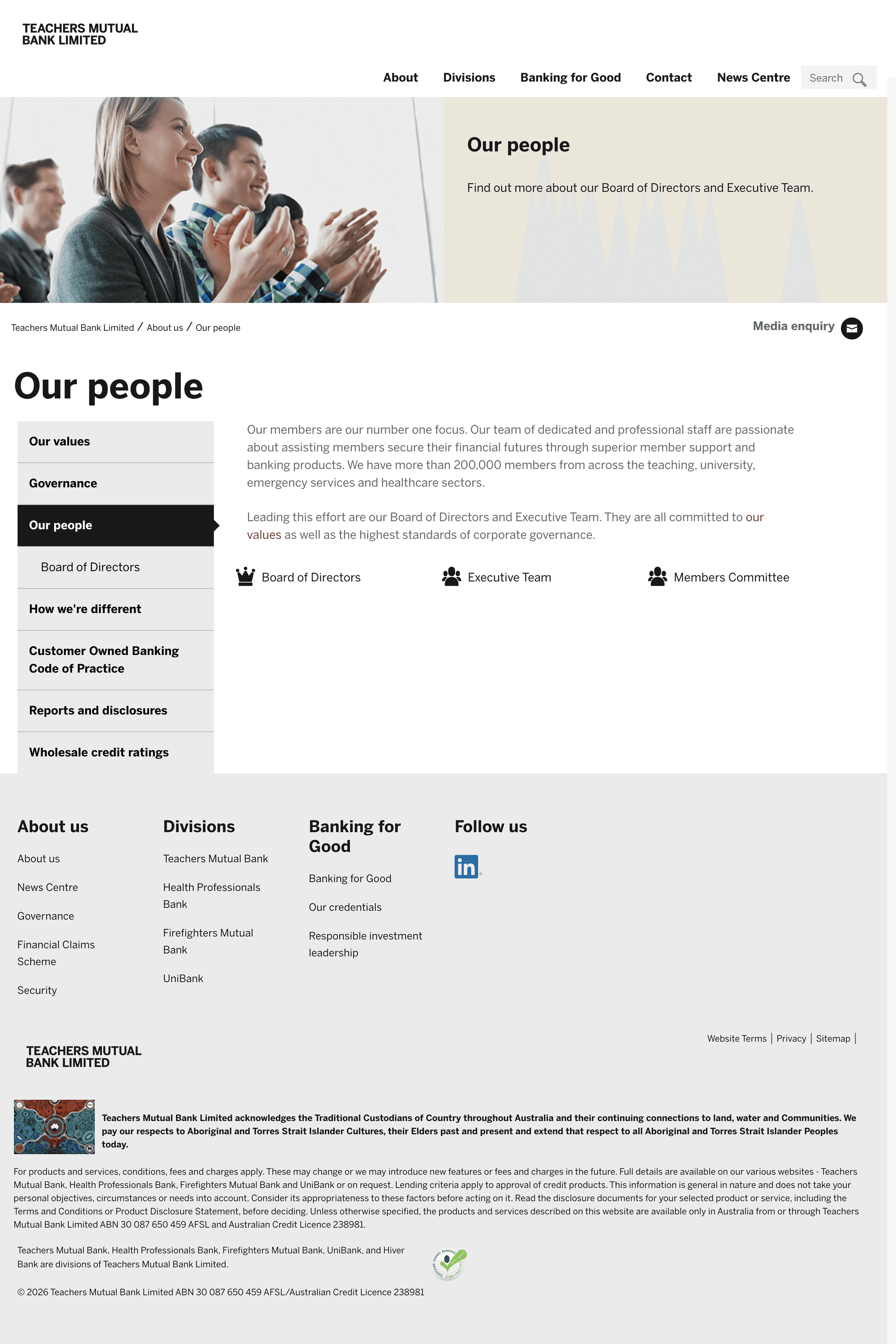
before #1
Our people (Leadership & governance)
Board of directors, executive team, and committee members were listed separately with little context on what TMBL leadership actually does or how the organisation runs.
after #1
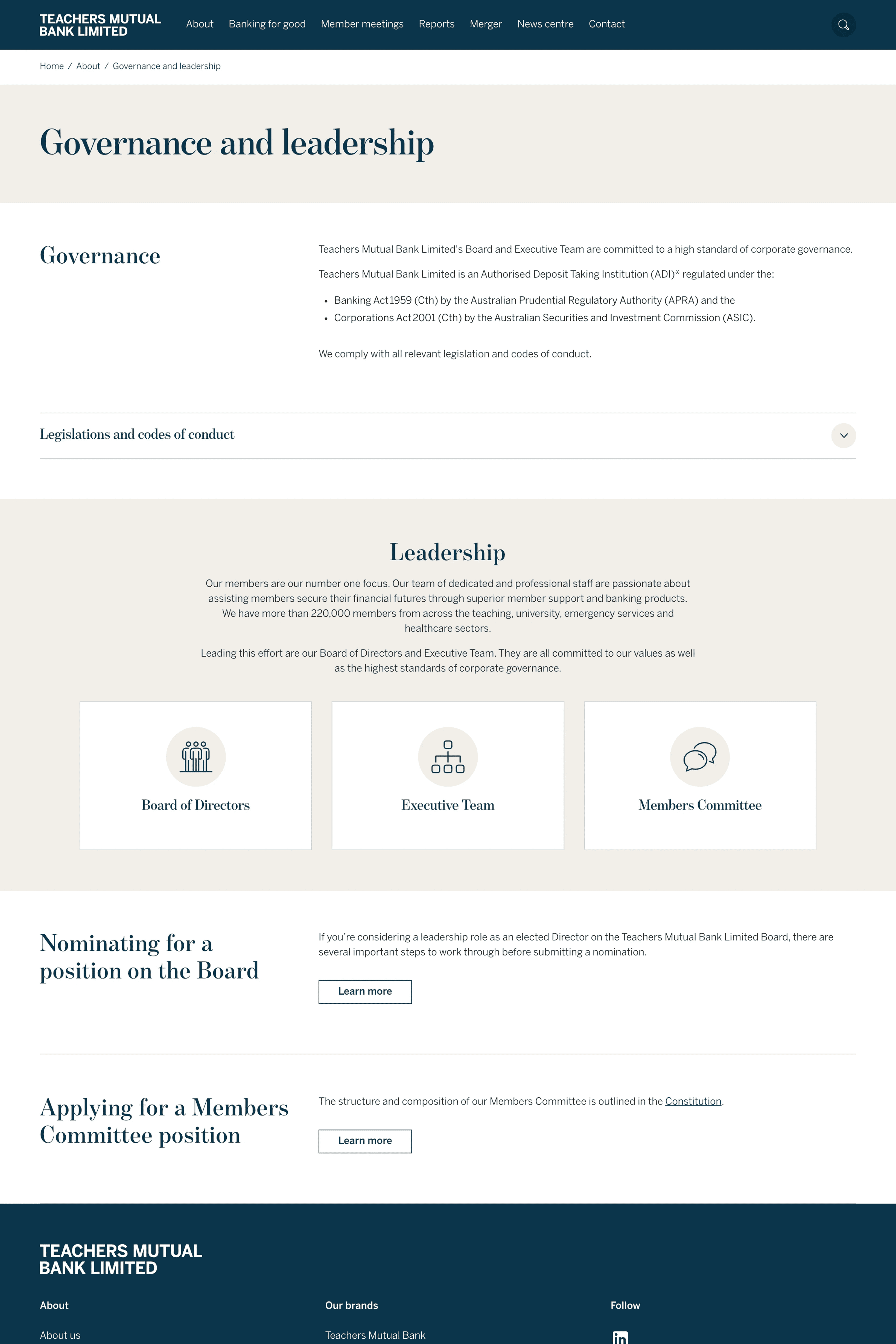
Our people (Leadership & governance)
Governance structure and leadership nomination processes are now embedded on the page, giving audiences a clearer picture of how TMBL operates as an organisation.
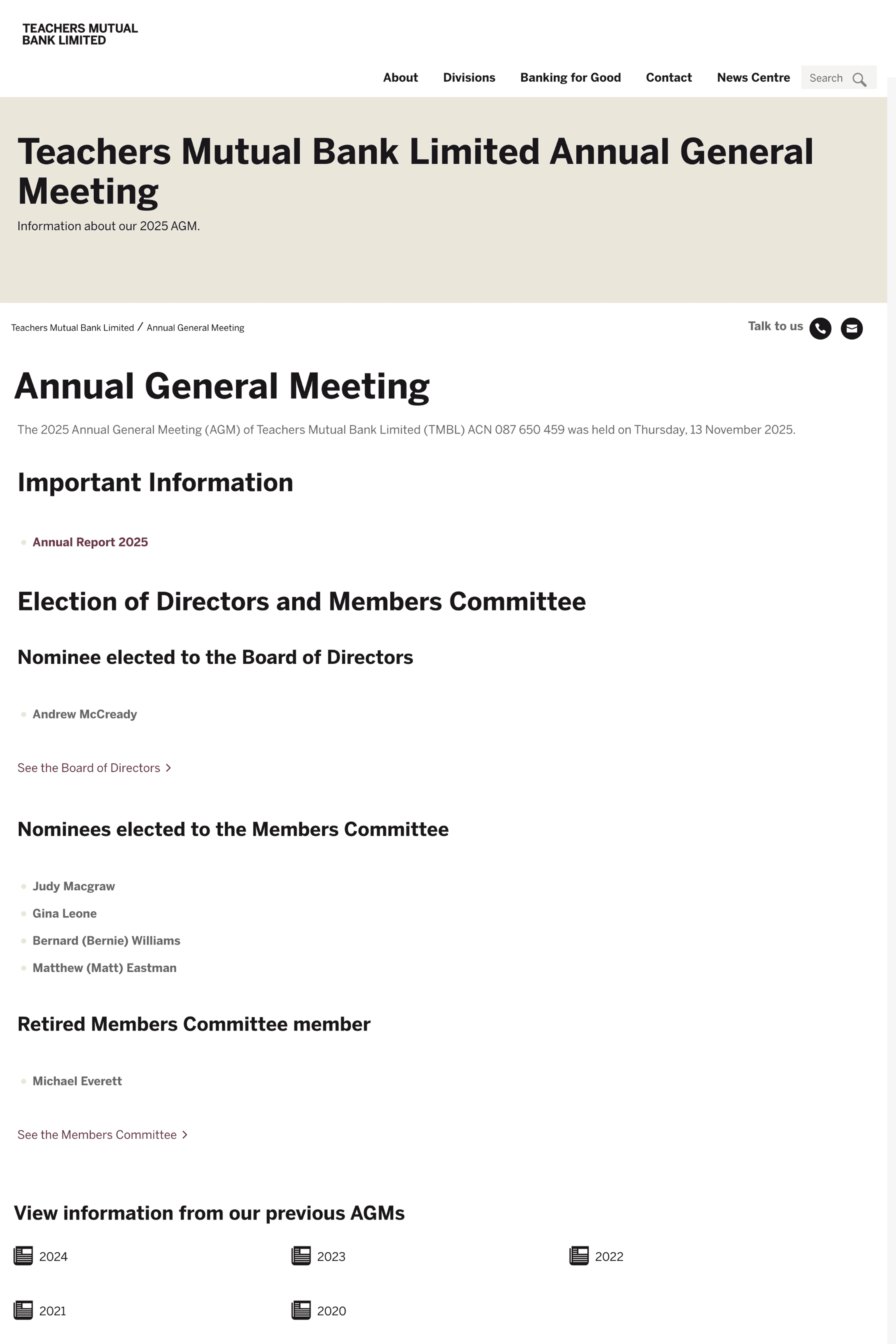
before #2
Member meetings & Annual General Meetings
Meeting materials and AGM notes weren't linked from the main navigation. Audiences had to hunt for them, often ending up on the wrong page.
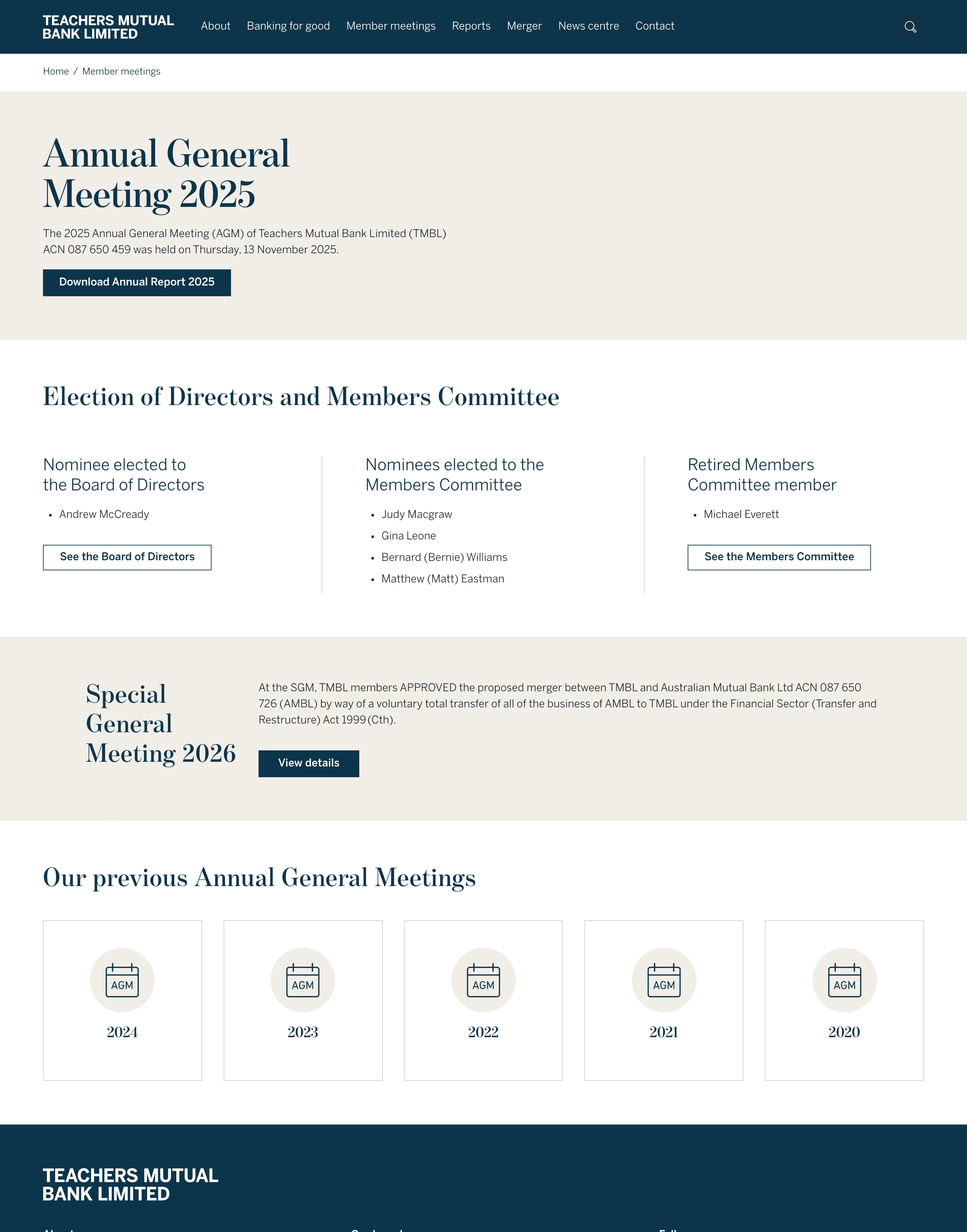
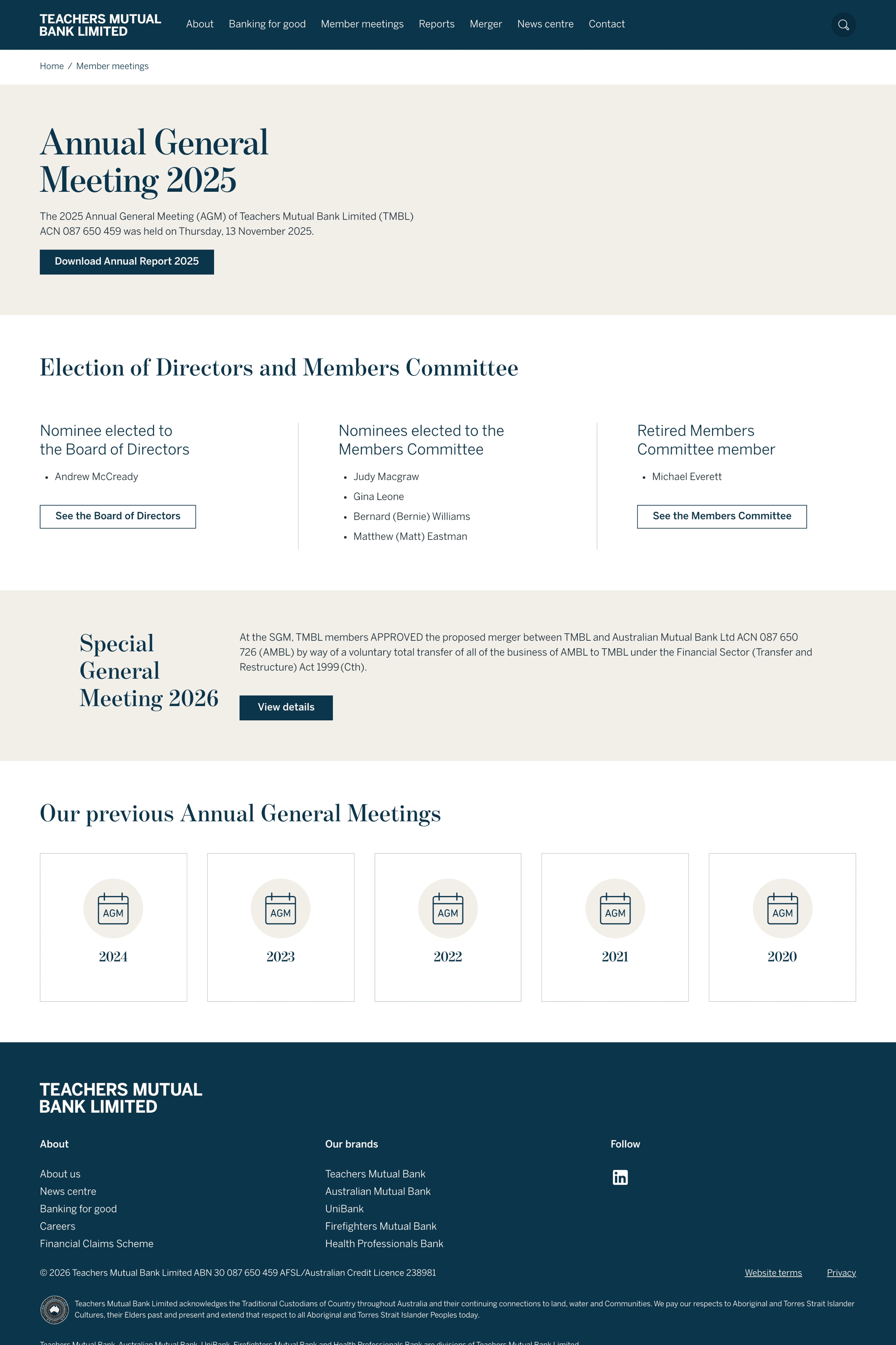
after #2
Member meetings & Annual General Meetings
Member meetings are now a standalone category in the main navigation. Materials are organised by year and meeting type, giving audiences clear visibility and faster access.
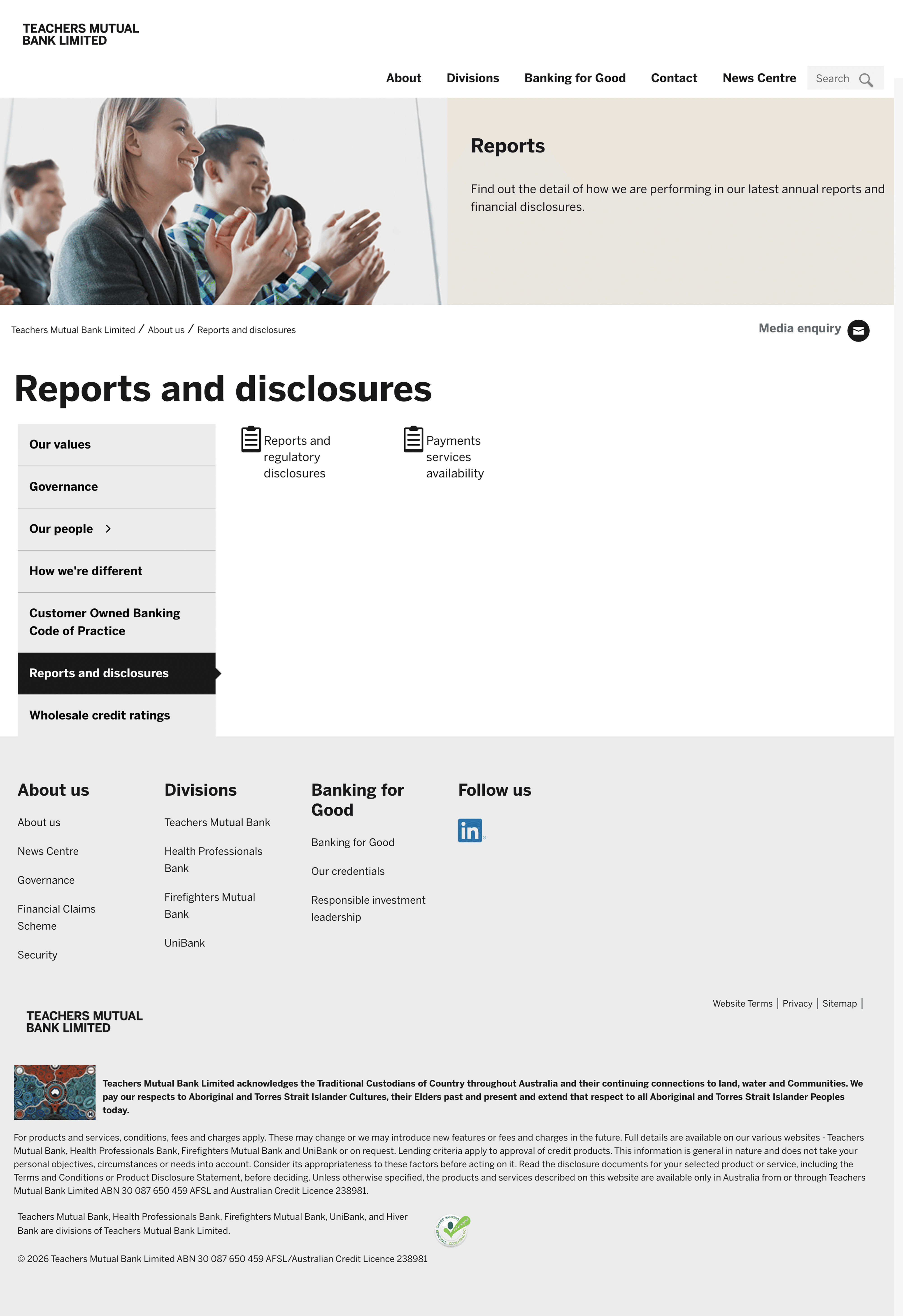
before #3
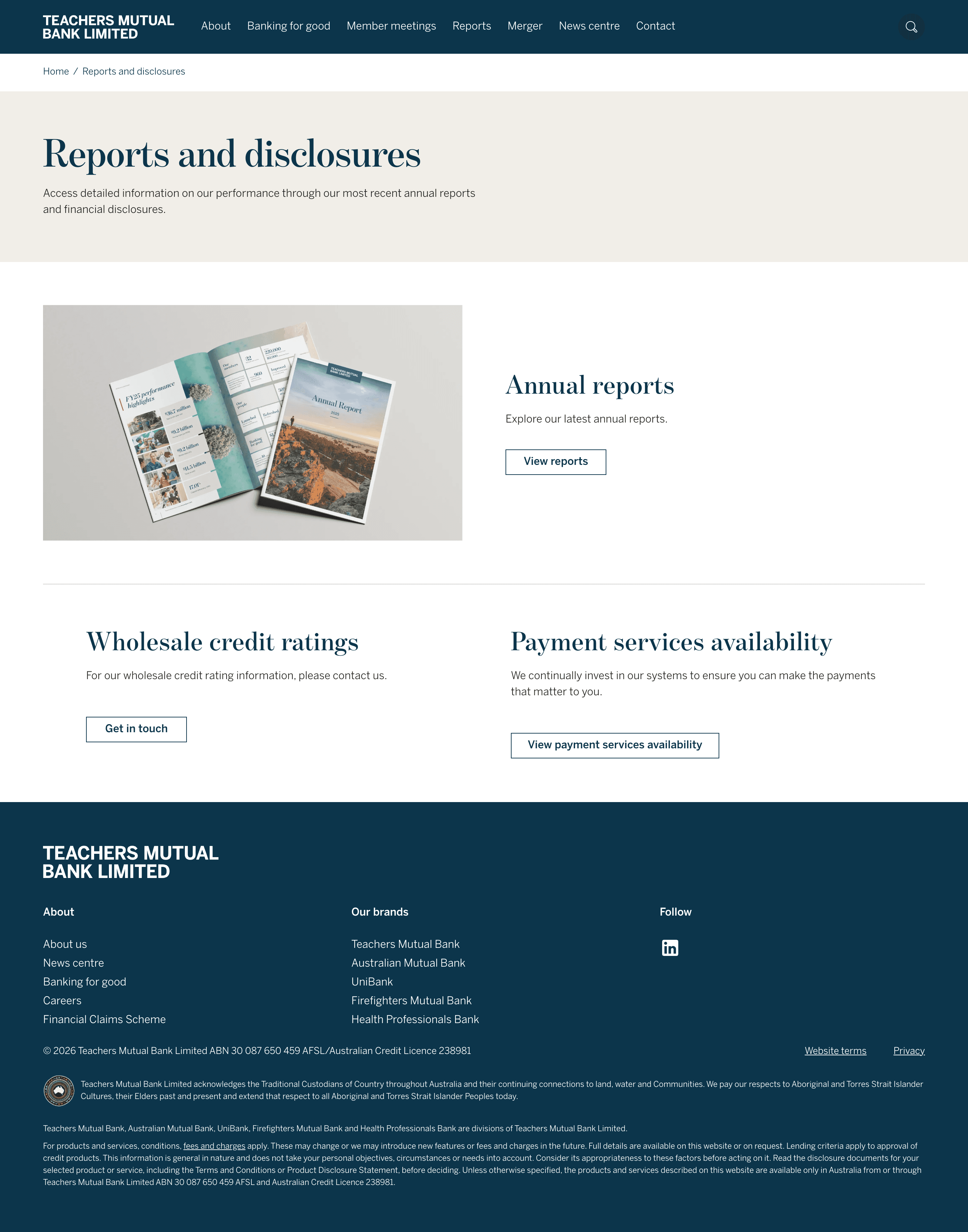
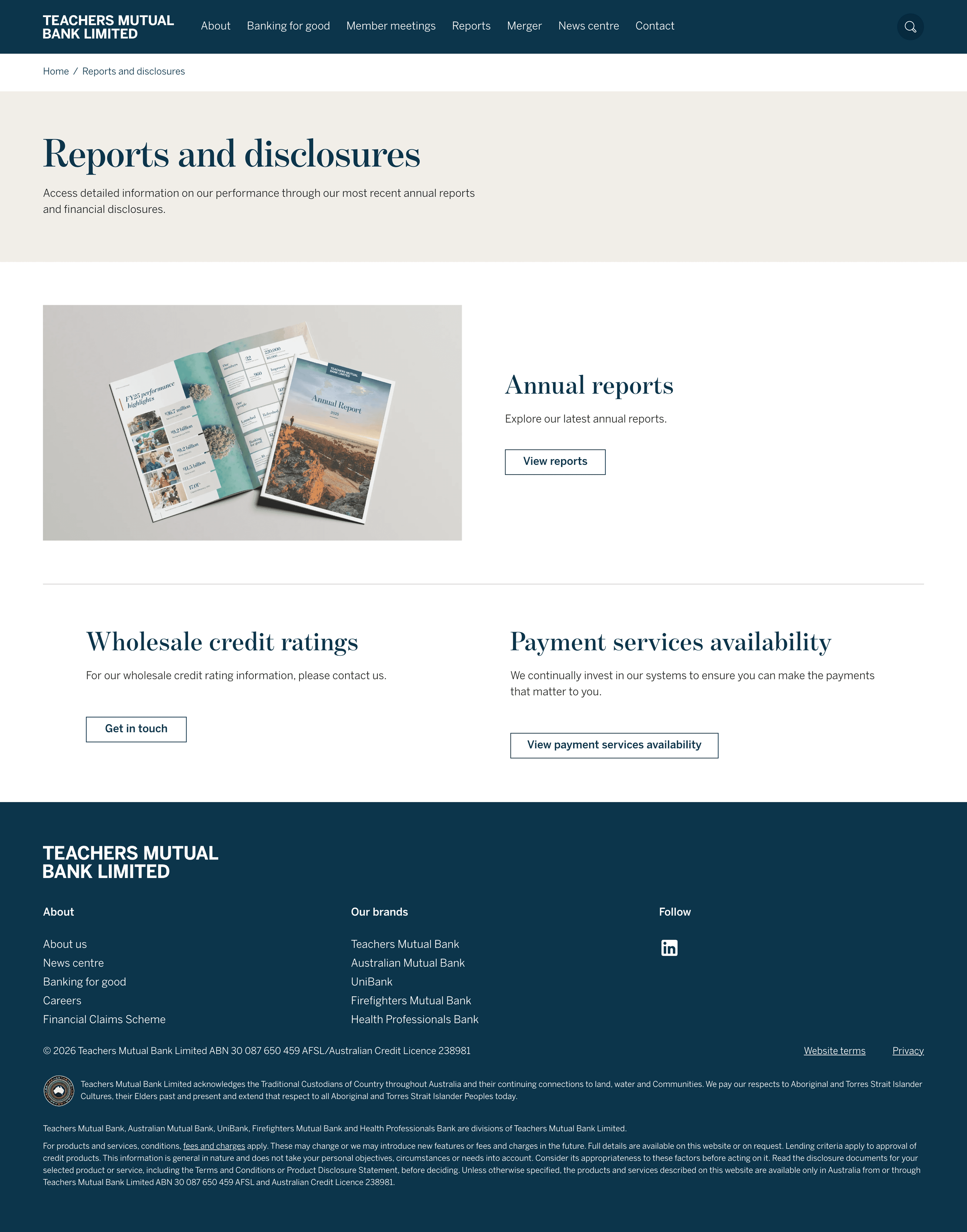
Reports & disclosures
Annual reports were nested under "About us"—technically findable, but the connection wasn't intuitive. Audiences searching for financial information often missed them.
after #3
Reports & disclosures
Reports are now their own top-level category. The latest report page serves as an index, linking to related documents (payment services availability, wholesale credit ratings, etc.), so audiences can browse the full picture in one place.
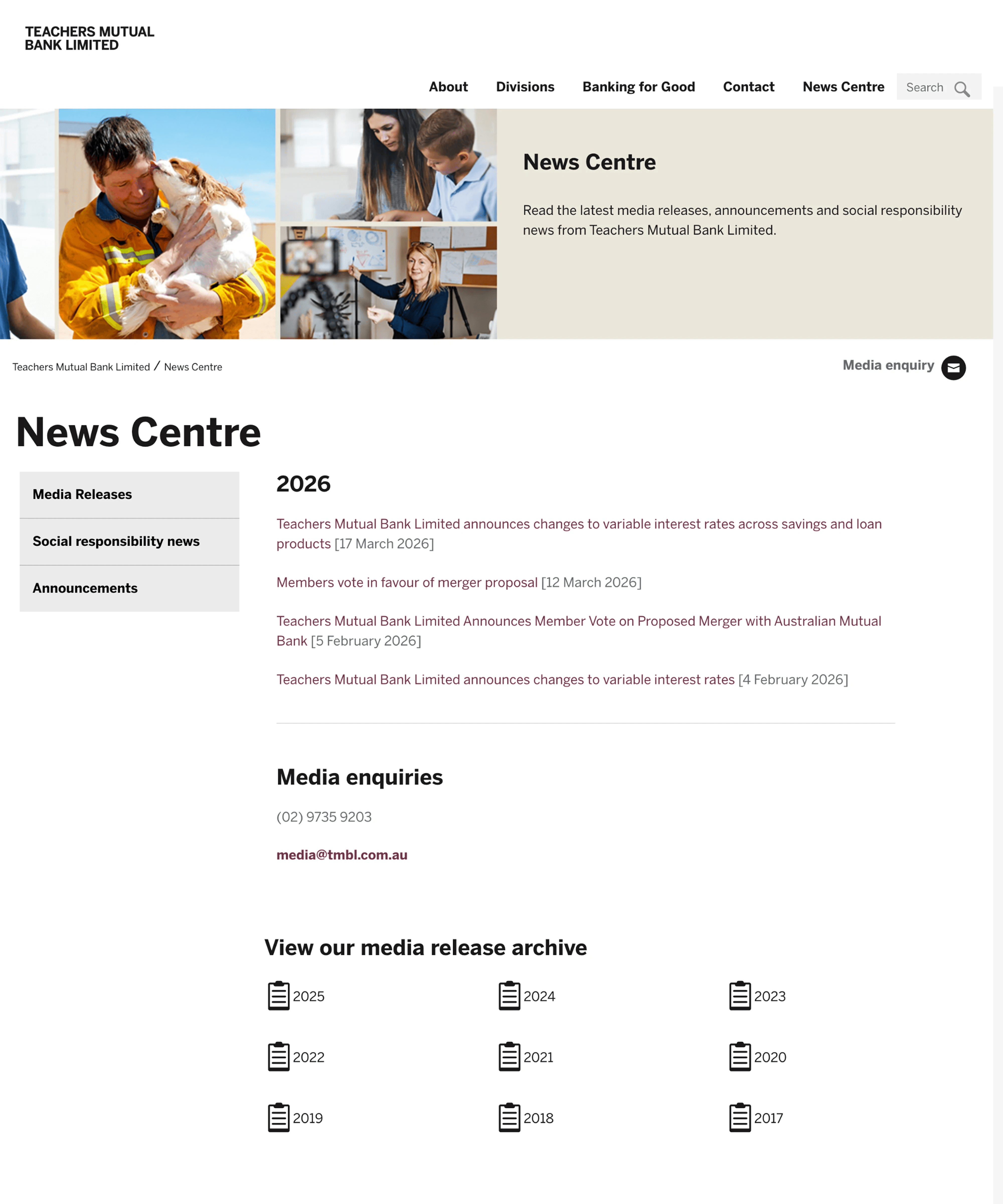
before #4
News centre
All news from the year was displayed in a single long list. If audiences wanted to review past years, they had to navigate to a separate page—adding friction and cognitive load.
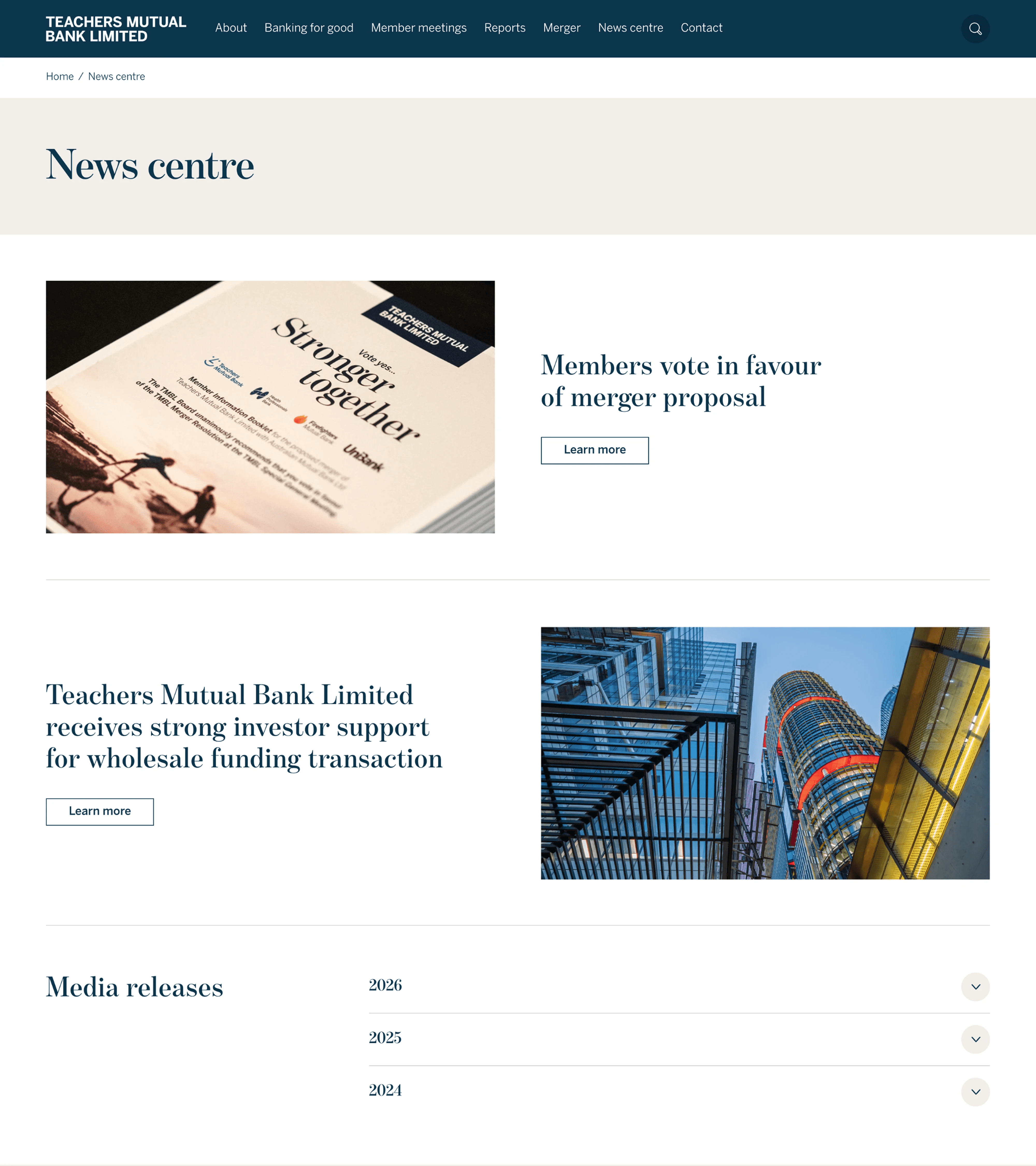
after #4
News centre
Highlighted news now has its own section instead of being buried in the list. Current and past-year news live in an accordion, reducing information overload whilst keeping everything findable.
What I learned
Resilience under pressure.
We had a tight timeline, and I learned to prioritise ruthlessly. But more importantly, I learned that pressure isn't an excuse to cut corners—it's a reason to ask for help early.
IA is a productivity multiplier.
On day 1 of the design sprint, I flagged that our information architecture included low-priority pages. We paused, refined the IA with the UX team, and streamlined scope. That one conversation saved the content team weeks of work—they could focus on what actually mattered.
Technical flexibility matters.
Mid-sprint, I picked up AEM authoring to fix visual inconsistencies the team couldn't get to in time. It wasn't in my original scope, but it kept momentum going and proved that being willing to learn new tools—even outside your job description—unblocks the team.
Asking for help is strategy, not weakness.
When the clock was ticking and I felt the workload slipping, I flagged it to the team and brought in the senior UI designer early. That decision kept us on track and the quality high.
The result
The site launched 5 May 2026. As a fresh launch, we're collecting stakeholder feedback now. But early signals are strong: audiences are finding information faster, the new design reflects TMBL's brand evolution, and the accessibility improvements mean more stakeholders can access critical company information.
The rebuild proved that good information architecture isn't invisible—it's the difference between a site that serves its users and one that frustrates them.