2025 – 2026
Digital experience uplift:
the biggest, hardest thing I've built so far
Role
Design system build · Interface design · Information architecture · AEM authoring
Plus: stakeholder workshops, pattern research, usability testing
Collaborated with
Senior UI designer, 2 UX designers, UI designer, UX researcher, plus marketing, brand, content, Internet Banking, and MarTech teams
Duration
May 2025 – June 2026
Retail sites launch date: 10 June 2026
Project in one line
Five websites. One new platform. A long-overdue clean-out of dated content. We rebuilt four retail banking sites plus one corporate site from scratch — and laid the groundwork for the next Internet Banking redesign.
Final outcome
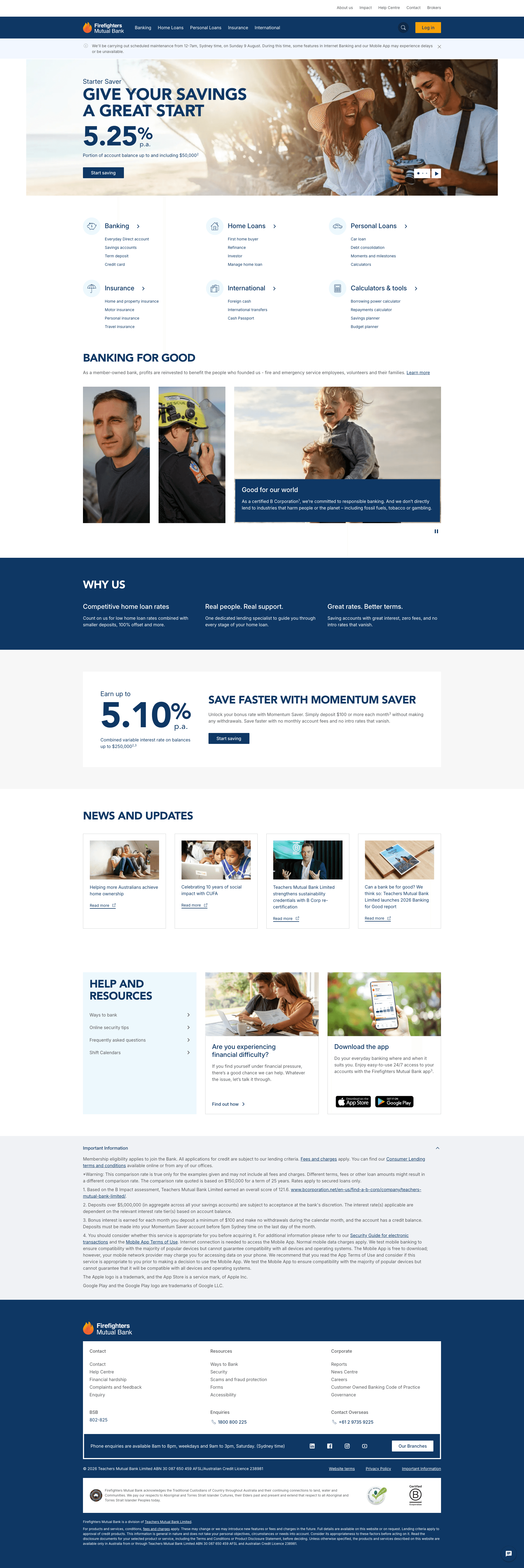
Homepages for all 4 retail brands, plus the corporate site — left to right:
Teachers Mutual Bank, Firefighters Mutual Bank, UniBank, Health Professionals Bank, and
Teachers Mutual Bank Limited (corporate).



Why it mattered
Teachers Mutual Bank Ltd owns four retail banking brands — Teachers Mutual Bank, Firefighters Mutual Bank, UniBank, and Health Professionals Bank — each with its own audience and identity. (A fifth brand, Australian Mutual Bank, joined the group mid-project and sat outside our scope.)
The old platform was ageing out in 2026. That forced a migration — but it also gave us licence to fix everything that had quietly been broken for years: no shared components across brands, inaccessible colours, information architecture, etc.
The old sites weren't just outdated. They didn't reflect a bank group that actually has good products to offer.
Analogy: We didn't renovate. We tore down the complex and rebuilt it — with different tools this time.
What changed – before & after
Since this was a full site revamp, I've highlighted four sections that show the transformation most clearly.
before #1

Internet Banking login, pre-June 2026
after #1

Internet Banking login, post-launch (June 2026)
before #2

About us, pre-June 2026
after #2

About us, post-June 2026
before #3

International, pre-June 2026
after #3

International, post-June 2026
Early metrics
In the first 20 days after launch (10–29 June 2026), the four rebuilt brand sites recorded almost 150,000 visits across the new homepages and Internet Banking experiences combined.
Early signal, but a strong one — real usage at scale within the first three weeks. Deeper metrics (conversion, task completion, retention) will build a fuller picture as the platform matures.
⭐️ Why this project is special to me
I saw this transformation happen from the inside, and from the very beginning. I joined the company early enough to work across three distinct eras of these sites — the very first version, the version that came before this one, and now the one that's live today. (Link to relevant case studies here for readers who want to see the before-state.) For the first ten months, I was the sole designer on this work — which meant I wasn't just watching these sites evolve, I was one of the people making it happen.
That length of involvement meant wearing far more hats than usual, and picking up skills I hadn't needed before: cross-functional stakeholder alignment, research to define reusable components, information architecture refinement, hands-on work with analytics tools, running design critiques, building out a design system, and thinking about product design at scale. I came out of this project a more mature designer than I went in.
At one stage, to keep the project on track, I stepped outside my usual scope entirely and took on AEM authoring — work that isn't typically expected of a designer. It wasn't part of the plan, but it turned out to be one of the most useful things I did: it gave me a real understanding of what producers actually deal with, and that now shapes how I design for them — and for every user group — going forward. It also sharpened something bigger: how I think about product evolution. Not just what a website looks like today, but how it can, and should, keep evolving.
Process – high level overview
The phases below happened mostly in sequence, though several ran in parallel — this was a big team effort, and a lot of what follows was shared work.
Research, planning & knowledge sharing
What I contributed to
We started with user and market research — identifying key journeys and personas across our banking and home loan products. I wasn't the primary researcher on this, so I supported with feedback rather than leading it.
We also structured the information architecture for the retail site, built out a URL manifest by category to make design decisions easier, and drafted core page templates — product category, product detail, support & service, campaign, legal, and others — to streamline the design work ahead.
What I owned
In parallel, I led the research into design patterns and components for our design system. I looked into 13 companies across banking, telecom, transport, and insurance, and pulled out 30 design patterns worth learning from — all from organisations with strong design maturity.
I then co-hosted a lunch & learn with the Digital Experience Lead to walk stakeholders through how and when each pattern should be used, gather feedback, and get buy-in–patterns like system status indicators, navigation menus, product comparison carousels, and product cards.
Building the design system aka the transition phase
This was very much a "get your hands dirty" phase — I built a tokenised design system to support the transition. I also demonstrated to the marketing team how it worked in practice with tokens — it clearly impressed them, and proved the design system could be sophisticated, scalable, and genuinely easy to maintain going forward.
Design phase & usability testing
The site is organised into roughly 18 sections — banking, legal, international, help centre, and more.
With a timeline under 12 months, we divided and conquered as a team: some of us built page templates, liaised with the brand and legal teams on copy, designed components and patterns, or crafted individual pages. We rarely had the luxury of doing things in the "right" order — ideally, components would be finalised before page design even started, but in practice the two overlapped constantly, with plenty of back-and-forth.
My own focus in this phase was component build, component documentation, and page design. The rhythm wasn't perfect at the start, but we settled into daily group critiques on page templates and page designs — which did a lot to keep the team aligned and set the right expectations.
Author phase (a bonus)
I never expected to learn AEM authoring, but when we were running out of time, I jumped in as a collaborative team member to help. I adjusted alignment, fixed spacing, changed hero banner background colours, uploaded images from the DAM, and published pages directly as an author. At one point I was even assembling entire pages by copying and pasting components from the template — maybe there's a part-time producer in me after all.
How I leveraged AI — individually and as a team
We started adopting Copilot as one of our productivity tools in early 2026, and I found a few genuinely useful ways to bring it into the workflow beyond the obvious.
Filling copy gaps
Stress-testing components with edge cases
Design system documentation
Picking up better collaboration habits from teammates
Ownership & collaboration breakdown
What I owned
Menu usability testing
Components: menu, footer, header, carousel, alert
Pages: International, Travel, and Internet Banking (login and logout) across 4 brands — Teachers, Firefighter, Health Professional, and UniBank
TMBL corporate site revamp
What I collaborated on
Colour combinations (background and text) and typography across 5 brands
Buttons
Component documentation
Pages: Insurance, Banking, category pages, homepage, and About/Corporate pages across 4 brands
Amongst the designers
Design critiques and design reviews — both on component builds and page builds
Work other teams built on
Before the new websites came along, I'd already designed pages to improve accessibility and raise the overall design bar — work that later became the foundation for:
Partnership websites, for example. NSW Teachers Federation
Financial hardship pages
If time could start again, what would I do differently
From a project collaboration perspective
From a data-driven designer perspective
From a resource management / strategy perspective